Last week I presented an academic poster over at Edinburgh. Even though I’d argue it was reasonably successful, getting lots of good feedback and some useful recommendations, I still think it could have benefited from being trimmed down to highlight the main points. I’ve uploaded it to Scribd so you can see for yourself:
Phoneme Demography Poster
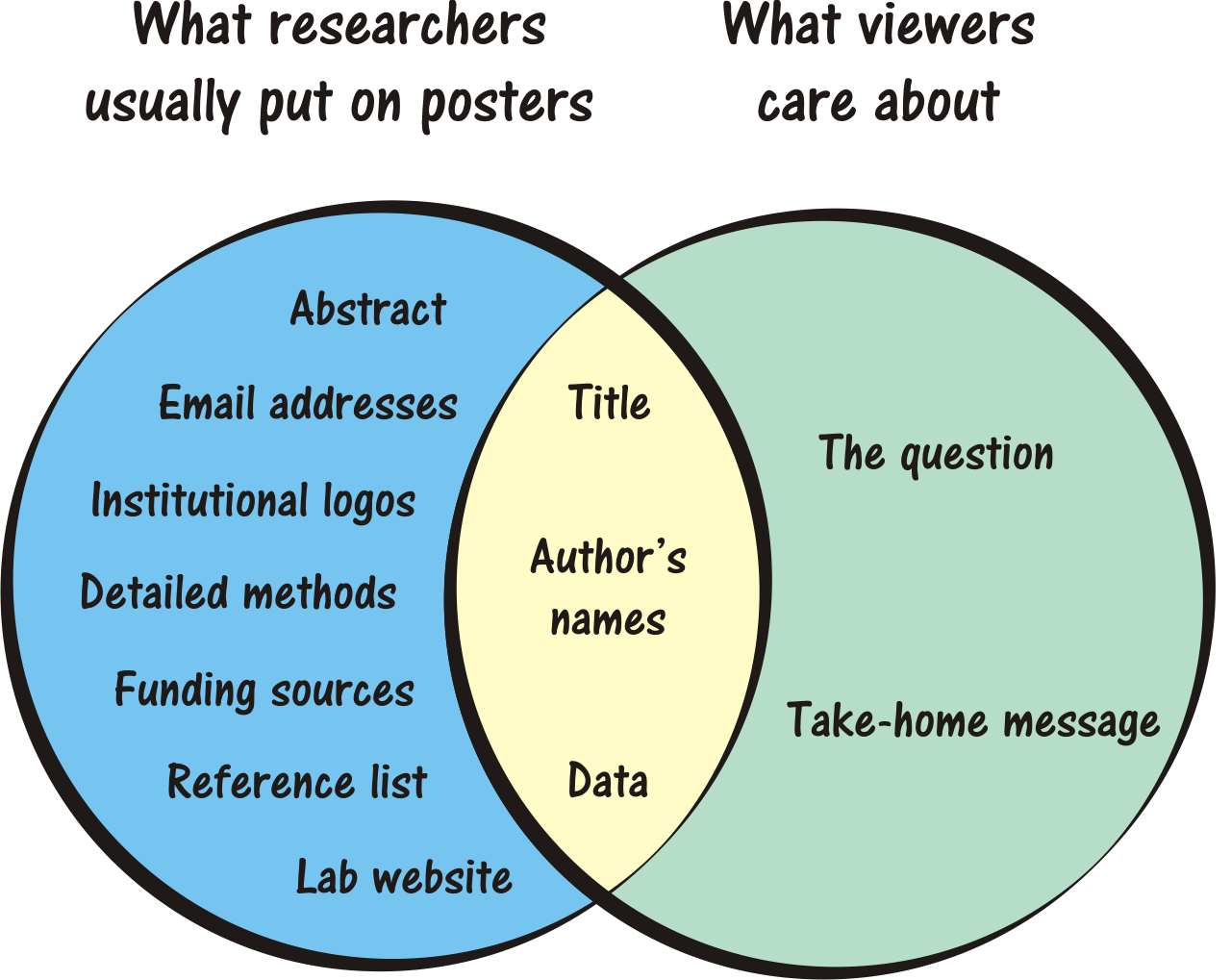
Since presenting I’ve come across this insanely useful poster Venn Diagram (H/T: John Hawks):
Now try and spot which aspects I didn’t cater for in my poster (hint: direct your eyes toward the right).

